Kitchen tiles are often chosen last, after cabinets are selected, counters are installed, and lighting is mostly complete. That’s when the question comes up: “What colour tile should I pick?” With everything else set, this choice of the kitchen tiles design sometimes gets rushed. Tile colour does more than fill gaps; it affects how the space feels, whether it’s early in the morning, under bright tube lights in the evening, or after a busy day of cooking. Some colours open up the room, while others cleverly hide everyday spills and crumbs.
In kitchens where design has to meet daily use, colour choice needs to be more than a mood board idea. In this post, we will highlight five modern kitchen tile designs and colours that are trending for good reason.
1. Beige and Cream Tile Colours That Always Work for Kitchens
Beige and cream colour tiles have stayed relevant in Indian kitchens for decades, not because they’re plain, but because they’re easy to live with. They blend well with almost any cabinet finish, whether you’ve chosen white laminates or wood textures.
Cream tiles don’t draw attention, and that’s a good thing in kitchens that already have strong elements like patterned backsplashes or bright utensils on display. They reflect light without looking clinical. Also, they’re a bit more forgiving when it comes to spills. Haldi stains, oil splashes, and even the dust from a long day of cooking don’t stand out much against beige tones.
Collections like Cordial and Ottimo from Simpolo Tiles and Bathware, a premium tiles company in India, carry these softer tones in matte or semi-gloss finishes. If your kitchen is compact or doesn’t get much sunlight, these tiles can help open up the space without making it feel cold.
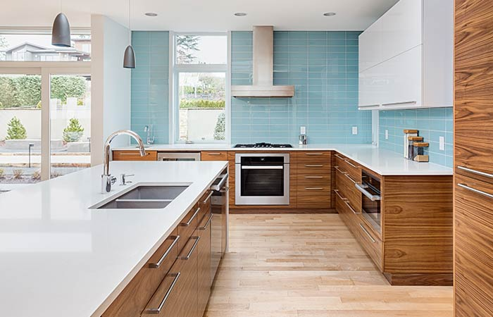
2. Charcoal and Slate Are The Practical Tile Choices for High-Use Kitchens
Darker tiles bring a solid, grounded feel to kitchens. Shades like slate grey, charcoal, and deep graphite are becoming popular, especially in open-plan kitchens that see plenty of activity. They’re a great choice if you want to add striking contrast.
In busy homes, these tiles do a good job of masking everyday wear and tear. Dirt isn’t obvious right away, and with the right texture, water spots and cooking marks are less noticeable too.
Tile ranges featuring darker tones come with finishes that make cleaning simple. They also work well in kitchens where lighting changes across the day, from early morning to late night, because they hold their tone consistently.
3. Greige and Taupe Are Understated Colours That Adjust to Their Surroundings
Not everyone wants regular kitchen tile colours. Greige, a mix between grey and beige, and taupe are two colours that quietly sit in the middle. They’re neither warm nor cool and don’t look too new or old. They just work, especially when the rest of the kitchen is a mix of styles or materials.
These colours adjust based on their surroundings. Against white walls, they look soft and creamy. With wooden cabinetry, they lean slightly cooler. This makes them a flexible choice that won’t clash with changing accessories, occasional, or seasonal updates.
4. Sage Green and Dusty Olive Bring A Refreshing Shift in Kitchen Tile Colour Palettes
Green tiles work well because they calm the space down. Muted greens like sage, dusty olive, or even light pistachio add a gentle pause in homes where the kitchen is part of the living area or is constantly in use.
These shades are a popular choice in modern kitchen tile design, particularly because they complement natural light and open shelving beautifully. They feel natural, like they belong next to indoor plants, wooden spice racks, or ceramic jars.
If your kitchen design leans minimal, or if you’re trying to break away from the usual white-and-wood pattern, this could be worth considering.
5. Terrazzo-Inspired and Speckled Tiles Are A Modern Take on a Retro Look
Not all modern kitchen tile designs are solid. Terrazzo is back, but not in the bold, multi-coloured way it used to be. The current version is more refined. It uses a light base like white, grey, or beige, with small specks of colour scattered across the surface.
These speckled designs hide a lot. It all blends in, be it a drop of tea, crumbs, or even a bit of spilled flour from kneading dough. For kitchens that are always active, or where cleaning happens in the evening after the rush, these tiles keep the floor looking neat without needing constant wiping.
Various collections from any leading tiles company in India offer these looks in larger formats, which help reduce grout lines. The design adds visual interest without looking too loud, and when paired with plain walls or cabinetry, it brings balance.
Conclusion
There’s no one perfect colour for every kitchen. But the right tile colour for your home is usually the one you don’t have to second-guess later. From soft neutrals to deeper greys and even greens, modern kitchen tile design trends are less about standing out and more about staying usable. Collections like Supra, Impero, and Tiny Tiles from premium suppliers like Simpolo Tiles and Bathware offer reliable choices that balance style and maintenance. They’re designed for kitchens that aren’t just for show but are used daily. And in the end, if a tile makes your kitchen feel more yours, more lived in, more comfortable, that’s the one worth choosing.