

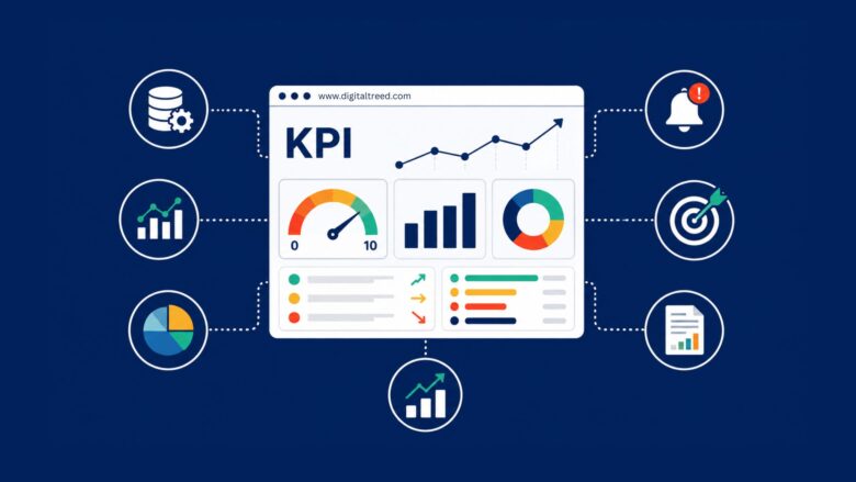
Picture the Monday morning before a quarterly review. Your operations lead is stitching together three spreadsheets, someone in finance is exporting a CSV that’s already a week old, and the marketing dashboard shows numbers that don’t match the sales report. Everyone is technically “tracking KPIs,” yet nobody can say – in one glance – whether the organization is actually on target. That’s the gap this guide closes. A KPI, or key performance indicator, measures how well you’re hitting a defined objective. KPI tracking is the ongoing practice of collecting, updating, and interpreting those measurements so you can act on them before they become problems. When spreadsheets and fragmented dashboards can’t keep up, you need a dedicated KPI tracking system.
Our top pick is Spider Strategies for organizations that need KPI management at scale, because it puts every metric on a common footing and surfaces trouble before anyone has to hunt for it. Two things set it apart: normalized 0 – 10 scoring that makes revenue, NPS, and cycle time directly comparable regardless of unit, and automated imports paired with smart alerts that flag a deteriorating metric long before it shows up in a quarterly review. For strategy and planning teams that need to connect high-level OKRs to measurable KPI performance inside a structured framework, Cascade is the strongest alternative. And for smaller, growing teams that want fast setup and mobile-friendly KPI visibility without heavy configuration, Databox is the practical choice.
Below, you’ll find the five best KPI tracking software tools of 2026, each evaluated on data connectivity, scoring and roll-up logic, alerting, ease of use, and fit for a specific team size. Here’s how we chose them.
How We Chose
We didn’t rank these tools by marketing spend or brand recognition. We selected them because each one excels for a distinct use case and team size. Here are the criteria we weighed.
Scoring And Normalization Logic
Can the tool put different metrics – measured in dollars, percentages, days, or counts – on a comparable scale? Normalization is what turns a pile of disconnected numbers into a coherent performance picture.
Data Connectivity And Automated Imports
The best KPI software pulls data in automatically. Manual entry is where accuracy and timeliness go to die, so we favored tools with broad integrations and scheduled imports.
Alerting And Proactive Notifications
Do you find out about a problem in real time, or three weeks later? Proactive alerts that flag anomalies as they happen separate serious performance management from static reporting.
Organizational Scalability And Roll-Up
Can a division head see a composite score without manually aggregating dozens of departmental metrics? Roll-up capability matters enormously for enterprise use.
Ease Of Use And Time-To-Value
How fast can a non-technical manager stand up a working KPI dashboard? We looked at setup friction and the learning curve.
Pricing Transparency
Some vendors publish tiers; others require a sales call. We flag both, so you know what to expect.
The 5 Best KPI Tracking Software Tools for Every Team Size
With those criteria in mind, here are the five best KPI tracking tools available in 2026. Each earned its spot because it excels for a specific team type or use case – from enterprise-wide performance management to always-on operational displays. Spider Strategies takes the top spot for teams that need scale and comparability, but the right pick depends on how your team actually works.
Here’s the shortlist at a glance:
- Spider Strategies – best for KPI management at organizational scale
- Klipfolio – best for flexible, real-time KPI dashboards
- Databox – best for mobile-friendly KPI reporting for SMBs
- Geckoboard – best for operational teams needing wallboard-style displays
- Cascade – best for strategy execution teams linking OKRs to KPIs
#1. Spider Strategies – Best for KPI Management at Organizational Scale
Spider Strategies, through its Spider Impact platform, is the tool to beat when you need every KPI on a common scale and problems surfaced automatically across departments.
The standout feature is normalized scoring. Spider Impact converts any metric – whether it’s measured in dollars, percentage points, or days – into a universal 0 – 10 score, so you can compare cycle time against net promoter score without doing mental gymnastics. That single design choice is what makes this KPI software so effective at the enterprise level: leadership can look at a normalized composite instead of squinting at fifteen differently-scaled charts. KPIs also roll up an organization tree, meaning a division head sees an aggregated performance score without manually combining departmental figures.
The rest of the platform reinforces that structured approach. Automated data imports keep your figures current without anyone re-keying numbers, and smart alerts notify metric owners the moment a KPI starts to slip – catching anomalies well before a quarterly review would. By the standard definition of a performance indicator, a KPI exists to measure progress against an objective – and Spider Impact is built around that idea rather than repurposed from generic BI. Everything lives in one centralized platform, which is exactly what replaces the spreadsheet-and-silo sprawl most operations teams start with.
| Pros | Cons |
|---|---|
| Normalized 0 – 10 scoring is a genuine differentiator – no other tool here offers it natively | No self-serve pricing; you’ll need a sales conversation to get numbers, which adds friction if you want to sign up instantly |
| Organization-tree roll-up gives leadership real-time visibility at every level | The roll-up model assumes a defined reporting hierarchy – flat or heavily matrixed teams need setup time to configure it well |
| Automated imports cut the data-entry burden dramatically | Less suited to ad-hoc BI exploration or free-form self-service data discovery |
| Alerts are proactive rather than retrospective | |
| Purpose-built for KPI tracking, not adapted from project or BI software |
Who it’s best for: Mid-market and enterprise organizations that need every KPI on a common scale and want deteriorating metrics flagged automatically across departments.
#2. Klipfolio – Best for Flexible, Real-Time KPI Dashboards
Klipfolio is built for data-savvy teams that want highly customizable, real-time KPI dashboards without leaning on IT.
Its calling card is flexibility. With a connector library spanning 100-plus cloud services, databases, and APIs, you can pull almost any metric from almost any source and shape it exactly how you want. The dashboard builder handles complex calculations and bespoke visualizations, and its reusable data components – Klips – let a marketing department build a KPI dashboard once and reuse the pieces elsewhere. Data refreshes in real time, so the numbers on screen are the numbers right now.
The trade-off for that power is a steeper learning curve. Klipfolio rewards technical fluency; if your team isn’t comfortable with data modeling, expect some onboarding time before dashboards feel effortless. And because pricing scales with data volume, growing teams can be surprised by their bill as usage climbs. Check current pricing on the Klipfolio site before you commit.
| Pros | Cons |
|---|---|
| Extraordinarily flexible – visualize nearly any metric from any connected source | Steeper learning curve than simpler tools; non-technical users need ramp-up time |
| Large connector library reduces integration effort | No native normalized scoring or organization-tree roll-up |
| Real-time KPI visibility without manual refreshes | Heavy customization can become time-consuming to maintain |
| Active user community and a healthy template library | Pricing scales with data volume, which can catch growing teams off guard |
Who it’s best for: Analysts and data-savvy marketing, sales, and operations teams who prize dashboard flexibility and live data over structured roll-up logic.
#3. Databox – Best for Mobile-Friendly KPI Reporting for SMBs
Databox is the fastest way for a small or midsize business to get KPI visibility across its everyday SaaS tools – and it shines on a phone.
Setup is the story here. With pre-built integrations for 70-plus popular platforms across CRM, marketing, finance, and support, you can assemble working dashboards in hours rather than days. The drag-and-drop builder keeps configuration light, and scorecards plus goal-tracking cover the basics of performance management without ceremony. The mobile app is a real standout: push notifications keep managers on top of KPI reports even when they’re away from a desk, which is a meaningful advantage for owner-operators and field leaders.
There’s also a benchmarking feature that lets you compare your metrics against industry peers – useful context when a raw number alone doesn’t tell you whether you’re doing well. The limitations show up when complexity increases. Databox isn’t built for multi-level organizational roll-ups or normalized cross-metric scoring, and customization is shallower than Klipfolio’s. Costs can also climb as you add data-source connections, so keep an eye on that as you scale.
| Pros | Cons |
|---|---|
| Fastest time-to-value on this list thanks to pre-built integrations | Not designed for complex hierarchies or multi-level roll-ups |
| Excellent mobile app for reviewing KPIs on the go | No normalized cross-metric scoring |
| Free tier allows risk-free evaluation before you pay | Advanced customization is limited compared with Klipfolio |
| Benchmarking adds helpful context to raw KPI numbers | Costs can rise quickly as data-source connections multiply |
Who it’s best for: Small and midsize teams that want quick setup and strong mobile KPI visibility across common SaaS tools without complex configuration.
#4. Geckoboard – Best for Operational Teams Needing Wallboard-Style KPI Displays
Geckoboard does one thing exceptionally well: it puts live KPIs on a big screen where a whole team can see them.
If you run a customer service team, a sales floor, or an operations center, Geckoboard’s TV-optimized layouts are hard to beat. The visuals are clean, high-contrast, and readable from across the room, which keeps real-time metrics in front of everyone all day and quietly reinforces accountability. Setup is straightforward – a non-technical team lead can drag and drop a KPI dashboard together and connect it to tools like Zendesk, Salesforce, or Google Sheets without help. Shareable dashboard links extend the same live view to remote staff.
Where Geckoboard bows out is analytical depth. It’s a display tool, not an analysis engine, so there’s no normalized scoring, no organizational roll-up, and a narrower integration list than Klipfolio or Databox. Executives who need aggregated strategic views should look elsewhere – this is a specialist that owns its niche rather than a full performance management platform. Pricing is subscription-based and scales by dashboards and users.
| Pros | Cons |
|---|---|
| Best-in-class for physical, wallboard-style KPI display | Limited analytical depth; not built for complex analysis or roll-ups |
| Extremely simple setup – team leads can configure it independently | No normalized scoring or organizational hierarchy features |
| Real-time visibility that improves on-the-floor accountability | Fewer integrations than Klipfolio or Databox |
| Clean, high-contrast design readable from a distance | Little value for executives needing aggregated strategic KPI views |
Who it’s best for: Support floors, sales teams, and operations centers that want always-on, real-time KPIs on shared screens.
#5. Cascade – Best for Strategy Execution Teams Linking OKRs to KPIs
Cascade is the pick when your challenge isn’t just tracking KPIs – it’s connecting them to the strategy they’re supposed to serve.
Most tools on this list show you metrics; Cascade shows you how those metrics ladder up to organizational goals. Its strategy-mapping tools align high-level objectives to departmental KPIs, and its native OKR support lets you link objectives and key results directly to the numbers you track. Add roadmap and initiative tracking alongside KPI performance, and you get reporting dashboards that answer “are we executing our strategy?” rather than only “what’s the metric today?” The concept of a key performance indicator translates across languages and frameworks – the French reference on indicateur clé de performance frames it the same way – and Cascade is built for organizations that treat those indicators as part of a formal execution discipline.
The flip side is complexity. Cascade takes more effort to implement than a pure dashboard tool, and it can feel over-engineered for a small team that just needs live operational numbers without a strategic framework. It also lacks the normalized cross-metric scoring that Spider Impact offers, so think of the two as complementary rather than competitive – they solve different problems. Pricing is tiered by organization size, with enterprise plans available on request.
| Pros | Cons |
|---|---|
| Uniquely strong at connecting strategy to execution – a gap pure dashboards miss | More complex to implement than pure KPI dashboard tools |
| OKR alignment is native, not bolted on | Overkill for teams that only need real-time operational metrics |
| Fits organizations running structured frameworks like Balanced Scorecard or OKR | No normalized cross-metric scoring comparable to Spider Impact |
| Solid collaboration and accountability features for cross-functional teams | Can feel over-engineered for smaller teams without a formal strategy process |
Who it’s best for: Strategy, planning, and leadership teams that need to connect goals and OKRs to measurable KPI performance within a structured framework.
Frequently Asked Questions
What’s The Difference Between KPI Tracking Software And A Spreadsheet?
A spreadsheet stores numbers you type or paste in; it doesn’t refresh itself, alert you, or aggregate across teams. Dedicated KPI tracking software connects to your data sources, updates automatically, and flags problems in real time. It also handles scoring, roll-up, and multi-user access that a spreadsheet simply can’t maintain reliably as your data and headcount grow. In short, spreadsheets are fine for a single analyst’s scratchpad, but they break down the moment KPI tracking becomes an organization-wide discipline.
Which Tool Is Best For Tracking KPIs Across Multiple Departments?
For real cross-departmental tracking, look for normalized scoring and organization-tree roll-up so one composite view reflects every team. Spider Strategies is built precisely for this, converting differently-scaled metrics into comparable scores that aggregate up the hierarchy. If your priority is instead linking those departmental metrics to strategic objectives, Cascade’s OKR alignment is the better structural fit. The best way to track KPIs across departments is to standardize how metrics are scored before you try to compare them.
What’s The Difference Between Spider Strategies And Cascade?
Both serve organization-wide performance management, but they emphasize different things. Spider Strategies centers on normalized 0 – 10 scoring, automated imports, and proactive alerts – it’s about making every metric comparable and catching anomalies early. Cascade centers on strategy execution, mapping OKRs and initiatives to KPIs so you can see whether your plan is actually working. Many organizations view them as complementary: Cascade frames the strategy, and a scoring-first platform like Spider Impact keeps the underlying metrics honest and current.
Which Is Best For A Small Team On A Budget?
Databox is the most SMB-friendly option here. It offers a free tier for risk-free evaluation, pre-built integrations that get you running in hours, and a strong mobile app – ideal for a lean team without a dedicated data analyst. Just watch the pricing as you add data-source connections, since costs can climb with usage. For a small team that mainly needs quick, mobile KPI reports, it’s hard to beat on time-to-value.
Can You Give A Real-World Example Of KPI Tracking In Action?
Sure. Imagine a customer service team tracking average resolution time. With a wallboard tool like Geckoboard, the metric sits live on a screen so agents self-correct throughout the shift. At the executive level, that same resolution-time KPI gets normalized into a 0 – 10 score in Spider Impact, rolled up alongside cost-per-ticket and satisfaction, and an alert fires the moment it trends the wrong way – surfacing the issue long before a quarterly review would.
What Are The 5 Main KPIs Most Organizations Track?
It varies by function, but five recurring categories cover most organizations: financial KPIs (revenue, margin, cash flow), customer KPIs (satisfaction, net promoter score, retention), operational KPIs (cycle time, throughput, defect rate), sales and marketing KPIs (conversion rate, pipeline, cost per acquisition), and people KPIs (turnover, engagement). The precise set depends on your objectives – the reference literature stresses that KPIs must always map to specific goals rather than be chosen generically.
Which Tool Is Best For Live Dashboards Versus Structured Reporting?
For live, endlessly customizable dashboards, Klipfolio wins on flexibility, while Geckoboard wins for always-on shared displays. For structured, scored reporting that rolls up across an organization, Spider Strategies is the stronger choice. The distinction matters: live dashboards answer “what’s happening now,” whereas structured reporting answers “how are we performing against our objectives” – and the best tool depends on which question dominates your week.
What’s The Best Way To Track KPIs Long-Term?
Long-term KPI tracking works best when data flows in automatically, metrics are scored on a consistent scale, and alerts catch drift early. Manual, one-off reporting decays fast because nobody sustains the effort. Pick a KPI tracking system that connects to your sources, standardizes scoring so comparisons stay meaningful over time, and notifies owners proactively. That combination keeps performance management continuous rather than something you scramble to reconstruct before each review.
The Verdict
The right KPI tracking software depends less on features on paper and more on how your team actually operates. If you run live operational floors, Geckoboard’s wallboards keep everyone honest in real time. If you want maximum dashboard flexibility, Klipfolio delivers. Small teams get the fastest, most mobile-friendly start with Databox, and strategy-driven organizations linking OKRs to metrics will find their home in Cascade.
But if your core need is KPI management at scale – every metric on a common footing, rolled up across departments, with problems flagged before they reach a quarterly review – Spider Strategies is the pick to beat, thanks to its normalized scoring and proactive alerts. The smart move is to weigh your own situation against the six criteria above, then trial the one tool that fits your use case. If comparability and early warning matter most to you, that’s the direction worth exploring first.
