
Quick answer
As of November 2026, Apple gives you two ways to restyle the Messages icon. On iOS 18 or later, the Home Screen's Customize screen can tint or darken every icon at once, and iOS 26 adds a clear look. A Shortcuts shortcut can wear your own picture and open Messages, but Apple documents no badge on it. If you rely on that count, try the tint first.
A messages icon aesthetic is a Home Screen style where the Messages icon matches the colors around it. On a pastel or all-dark screen, the green Messages tile can be the one icon that clashes with the rest. You can fix that with Apple's own settings and the Shortcuts app, no icon pack from an unknown site needed.
Your pick comes down to the badge. Tinting keeps the real app and its unread count. Apple's pages don't document a badge on a shortcut.
Key takeaways
- Tinted on iOS 18 or later restyles Messages and keeps its unread badge.
- Apple's Customize screen changes every icon, never Messages alone.
- A Shortcuts icon can be any photo, but Apple documents no badge on it.
- CC0 and CC BY icons can be recolored; edited ND icons can't be shared.
- White bubbles on light tiles failed 3:1 in 4 of our 12 made-up palettes.
Which Messages icon looks can you change without an app?
Only the look of every icon at once. Apple's Customize screen has no per-app choice. Your iOS version decides which looks it offers.
iOS 18 brought the first two options. Apple's iOS 18 update notes say "Dark icons give your Home Screen look a darker aesthetic". The same notes add that "Color tinting lets you apply any color to app icons and widgets". The iOS 18 edition of the iPhone User Guide lists Dark, Light and Automatic, plus Tinted with color and saturation sliders. iOS 26 added a clear look. Its update notes say "App icons get a fresh new look with Liquid Glass", and the iOS 26 edition of the guide adds a Clear button for translucent icons. On iOS 27, the What's new in iOS 27 page adds a Liquid Glass slider "from ultraclear to fully tinted".
That page doesn't say the slider recolors app icons. And the Customize page, in all three versions, has no per-app option.
Tint, darken or clear every icon at once
That screen's Tinted option keeps Messages as the real app, badge and all. These steps follow Apple's current Customize page, which lists iOS 27 as of November 2026.
- Touch and hold an empty part of the Home Screen until the icons jiggle.
- Tap Edit, then choose Customize.
- Tap Dark for dark icons, or Auto for dark at night and light by day.
- Tap Clear for translucent icons, then choose Light, Dark or Auto.
- Tap Tinted, then drag the color and saturation sliders, or use the eyedropper on your wallpaper, then choose Light, Dark or Auto.
If your icons went blank after a tint on an early iOS 26 build, that's a bug Apple has fixed. Install the update and tint again. Apple's iOS 26 notes list "App icons may appear blank after adding a custom tint" among the iOS 26.0.1 fixes.
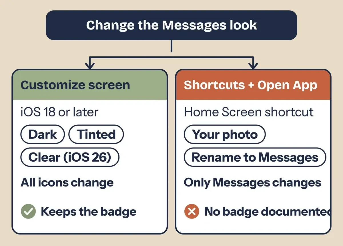 Diagram by DigitalTreed: the two Apple routes to a new Messages look, from the iPhone User Guide and Shortcuts User Guide, November 2026.
Give Messages its own picture with Shortcuts
A Home Screen shortcut can wear any photo as its icon, and here its one job is opening Messages and nothing else. Apple's Shortcuts guide to adding a shortcut to the Home Screen lets you set the icon with Take Photo, Choose Photo or Choose File. You can rename it there too. The Open App action picks the app. Apple's page on share actions lists it as "Open URLs, Open App, Open In" and says you can find it by searching for open. Apple's pages stop there. Step 3 below is just picking Messages inside that action. Save your icon image to Photos or Files before you start.
- Open the Shortcuts app and tap the Add button to start a new shortcut.
- Tap Add Action, type open in the search field, and choose Open App.
- In the Open App action, pick Messages as the app it opens, then tap Done.
- Open the new shortcut's Details and tap Add to Home Screen.
- Tap the icon under Home Screen Name and Icon, then tap Choose Photo or Choose File.
- Tap the name, type Messages, tap Return, then tap Add.
- Touch and hold the old Messages icon, tap Remove App, then tap Remove from Home Screen.
Step 7 doesn't delete anything. Apple's page on removing apps says "The app moves to App Library and can still be used from there." The App Library page adds that removed apps stay listed there by category. Our Spotify icon aesthetic guide applies the same method to Spotify, with its own color ideas.
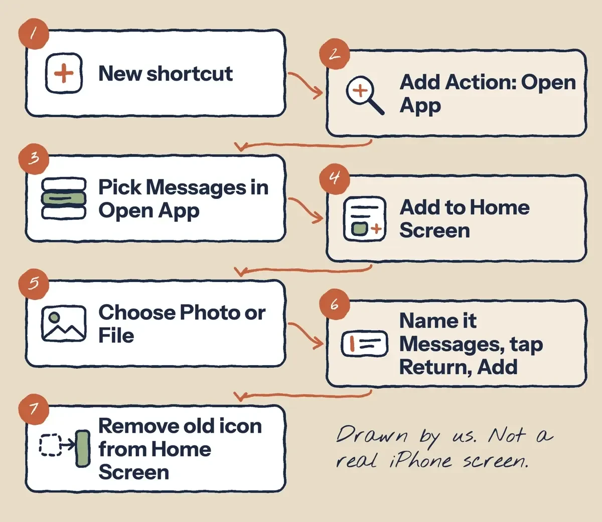 Drawn by us: the Shortcuts steps, based on the Shortcuts User Guide, November 2026. Not a real iPhone screen.
What you give up with a shortcut icon
A Home Screen shortcut that opens Messages is a separate item from the app, and the unread badge is the clearest loss. Apple's notification settings page treats badges as a per-app setting: "Show a badge on the app icon: Turn on Badges." Apple's Shortcuts pages don't document a badge on a Home Screen shortcut. So we expect the count to stay on the real Messages icon. If the count matters, keep that icon in the Dock. If you move the real icon to App Library, its badge shows there only after you turn on Show in App Library under Settings > Home Screen & App Library.
A tap works differently too. A Home Screen shortcut runs its actions, here a single Open App, like any workflow in Apple's Shortcuts guide on custom shortcuts. Apple doesn't say how fast that runs, and since we didn't time it on a real phone, we make no claim about any delay before Messages opens. Then there's the screen-wide look. Apple's Customize steps cover app icons and widgets, and neither guide says whether a photo icon takes the Dark or Tinted style once you switch the whole screen over. Build your picture in its final colors rather than counting on the tint.
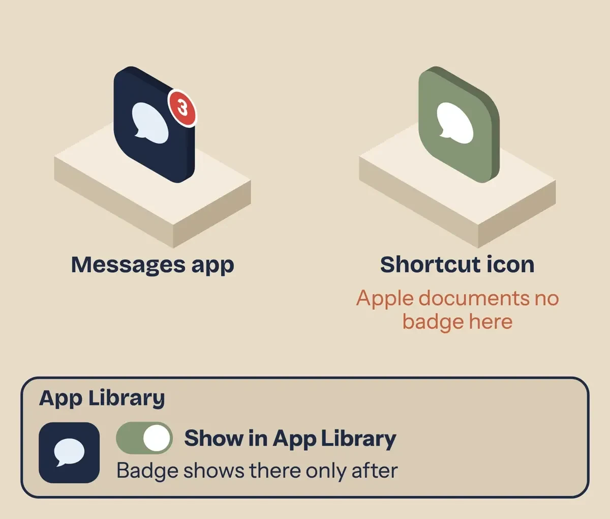 Diagram by DigitalTreed: where the unread badge appears, based on Apple notification and App Library pages, November 2026.
Icons you're allowed to use, and where to find them
Before you swap in a picture, check who owns it, because an icon from an image search belongs to someone even when there's no notice on it. The US Copyright Office's general copyright FAQ says a work is protected "the moment it is created and fixed in a tangible form". It also calls registration voluntary. Logos can carry a second layer of rights. The Copyright Office's FAQ on what copyright protects says names, slogans and logos "may be protected as trademarks". The USPTO page on trademark basics says a trademark identifies the source of goods or services. We're sticking with icons on your own phone here, and this isn't a legal opinion.
When an icon comes with a Creative Commons license, the license name tells you what you may do with it. The Creative Commons licenses page lists six license types, and the table adds CC0. Here's how each treats an edited copy, credit and commercial use:
| License | Share a recolored copy? | Credit needed? | Commercial use? |
|---|---|---|---|
| CC BY | Yes | Yes | Yes |
| CC BY-SA | Yes, share edits under the same terms | Yes | Yes |
| CC BY-ND | No | Yes | Yes |
| CC BY-NC | Yes | Yes | No |
| CC BY-NC-SA | Yes, share edits under the same terms | Yes | No |
| CC BY-NC-ND | No | Yes | No |
| CC0 (public domain dedication) | Yes | No | Yes |
ND matters most for a Home Screen project. CC's licenses page says ND means "No derivatives or adaptations of your work are permitted", and the CC BY-ND 4.0 deed says you "may not distribute the modified material". So skip ND icons when you want to recolor one and share it. NC limits use to purposes "not primarily intended for or directed towards commercial advantage or monetary compensation". The CC0 deed lets you "copy, modify, distribute and perform the work, even for commercial purposes, all without asking permission". With CC0, you can recolor an icon and leave the credit line off.
For a CC BY icon, the CC BY 4.0 deed asks for credit, a link to the license and a note if you changed the work. CC's recommended attribution practices suggest the title, author, source and license. Save that line in a note next to the image file.
An icon you make yourself doesn't need a license at all. A plain speech bubble on a colored square takes a few minutes in any app from our roundup of free photo editors. Under the Copyright Office FAQ above, it's protected from the moment you save it, and since you made it, you're free to recolor it whenever your wallpaper changes. If you've made your own WhatsApp stickers, you already know the export steps.
Palette ideas for a Messages icon
On a homemade icon, the bubble needs enough contrast with its tile to read at Home Screen size. WCAG 2.2, the W3C accessibility standard, sets 3:1 as the minimum contrast for graphical objects in success criterion 1.4.11. Its Understanding Non-text Contrast page says the term "applies to stand-alone icons such as a print icon".
We made up every pair below. All 12 reach 3:1 as listed, but four got there only after our script darkened the tile.
- Sage bubble: tile #859574, bubble #FFFFFF (3.21:1 contrast)
- Oat milk: tile #E8DCC8, bubble #6B4F3A (5.53:1 contrast)
- Midnight ink: tile #1F2A44, bubble #E6EEF7 (12.18:1 contrast)
- Blush note: tile #AB8B88, bubble #FFFFFF (3.10:1 contrast)
- Terracotta: tile #C4623F, bubble #FFF4E8 (3.75:1 contrast)
- Lavender haze: tile #C9B8E8, bubble #3D2E5C (6.60:1 contrast)
- Matcha: tile #B7C99A, bubble #2F3B22 (6.69:1 contrast)
- Ocean glass: tile #2E6F8E, bubble #FFFFFF (5.55:1 contrast)
- Butter: tile #F6E7A1, bubble #7A5C00 (5.02:1 contrast)
- Charcoal mono: tile #2B2B2B, bubble #F5F5F5 (12.99:1 contrast)
- Soft apricot: tile #B98869, bubble #FFFFFF (3.09:1 contrast)
- Mint cream: tile #859990, bubble #FFFFFF (3.02:1 contrast)
Paste a line into Notes, then type both hex codes into your editor's color fields, and if it reports contrast, the number should land within a rounding step of ours. The table gives each palette's score as first picked and the darkened tile that fixed each failure.
| Palette (made up) | Tile | Bubble | Contrast | 3:1? | Fixed tile |
|---|---|---|---|---|---|
| Sage bubble | #9CAF88 | #FFFFFF | 2.36:1 | Fail | #859574, darkened 15% (3.21:1) |
| Oat milk | #E8DCC8 | #6B4F3A | 5.53:1 | Pass | |
| Midnight ink | #1F2A44 | #E6EEF7 | 12.18:1 | Pass | |
| Blush note | #F4C7C3 | #FFFFFF | 1.52:1 | Fail | #AB8B88, darkened 30% (3.10:1) |
| Terracotta | #C4623F | #FFF4E8 | 3.75:1 | Pass | |
| Lavender haze | #C9B8E8 | #3D2E5C | 6.60:1 | Pass | |
| Matcha | #B7C99A | #2F3B22 | 6.69:1 | Pass | |
| Ocean glass | #2E6F8E | #FFFFFF | 5.55:1 | Pass | |
| Butter | #F6E7A1 | #7A5C00 | 5.02:1 | Pass | |
| Charcoal mono | #2B2B2B | #F5F5F5 | 12.99:1 | Pass | |
| Soft apricot | #F7B58C | #FFFFFF | 1.76:1 | Fail | #B98869, darkened 25% (3.09:1) |
| Mint cream | #CDEBDD | #FFFFFF | 1.27:1 | Fail | #859990, darkened 35% (3.02:1) |
The two lightest tiles did worst with a white bubble: Mint cream scored 1.27:1 and Blush note 1.52:1 before the fix. Darken the tile, as in the fixed rows, or switch to a dark bubble the way the Oat milk and Matcha rows do at 5.53:1 and 6.69:1. Our tips on making posts and flyers look professional use the same WCAG check.
Our script, test/palette_check.py, applies the WCAG 2.2 formula. Each color's relative luminance is 0.2126 R + 0.7152 G + 0.0722 B on linearized sRGB values. The ratio is (L1 + 0.05) / (L2 + 0.05), and the script checks that black on white gives 21:1 before it scores anything.
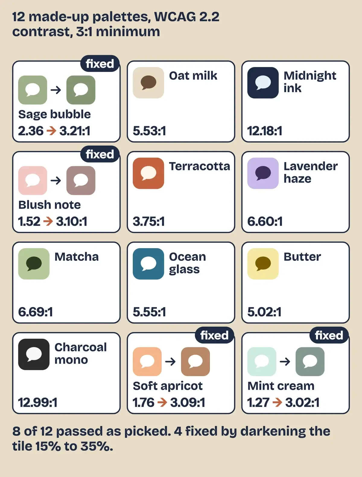 Diagram by DigitalTreed: our 12 made-up palettes and their WCAG 2.2 contrast ratios from test/palette_check.py, November 5, 2026.
What we tested
We ran test/palette_check.py offline on November 5, 2026, on 12 palettes we made up. Eight passed 3:1 as first picked. All four failures paired a light tile with a white bubble: Sage bubble, Blush note, Soft apricot and Mint cream. Darkening each failing tile in 5% steps fixed it after 15% to 35%.
Our pick: tint first, a shortcut for art you own
Start with Tinted and the eyedropper. It keeps the real Messages app and its badge, and undoing it means going back to the same Customize screen. Switch to a shortcut only for a picture you made or hold a license for.
Problems inside Messages aren't fixed by a new icon. If threads went missing after a phone swap, our guide to moving Messages to a new iPhone walks through getting them back. Voice notes that won't send have their own fix for audio messages. And for texts full of shorthand, our RD meaning explainer decodes one common one.
FAQ
Frequently asked
Can I change only the Messages icon without Shortcuts?
No. The Customize screen restyles all app icons and widgets together. Its one size option, large icons, also hides app names.
Does icon tinting work on iOS 17?
No. Apple's iOS 18 notes list dark icons and color tinting as new in iOS 18, so you need iOS 18 or later.
Can I delete the Messages app after making the shortcut?
Keep it installed, because the shortcut needs Messages to open. Apple's remove apps page also notes "Some Apple apps can be removed from the Home Screen but can't be deleted from iPhone."
Does the shortcut icon trick work on iPad?
Yes. Apple's Shortcuts icon page covers iPhone or iPad, and on either you can use a photo from your library as the Home Screen icon.
How we made this guide: We read 23 Apple, US Copyright Office, USPTO, Creative Commons and W3C pages on November 5, 2026, and saved text copies to check every quote. We didn't install icon packs or run these steps on an iPhone. Facts checked by the DigitalTreed team on November 5, 2026.
First published December 2023 with icon site picks and no sources. Rewritten November 5, 2026 around Apple's own steps, with the third-party icon sites removed.
Sources
- Apple iPhone User Guide: Customize apps and widgets on the iPhone Home Screen (current)
- Apple iPhone User Guide, iOS 18: Customize apps and widgets on the Home Screen
- Apple iPhone User Guide, iOS 26: Customize apps and widgets on the Home Screen
- Apple Support: About iOS 18 Updates
- Apple Support: About iOS 26 Updates
- Apple iPhone User Guide: What's new in iOS 27
- Apple Shortcuts User Guide: Add a shortcut to the Home Screen on iPhone or iPad
- Apple Shortcuts User Guide: Modify shortcut colors and icons
- Apple Shortcuts User Guide: Create a custom shortcut
- Apple Shortcuts User Guide: About share actions
- Apple iPhone User Guide: Change notification settings
- Apple iPhone User Guide: Find and use your apps in App Library
- Apple iPhone User Guide: Remove or delete apps
- US Copyright Office: Copyright in General (FAQ)
- US Copyright Office: What Does Copyright Protect? (FAQ)
- USPTO: What is a trademark?
- Creative Commons: About CC Licenses
- Creative Commons: Attribution 4.0 International deed
- Creative Commons: Attribution-NoDerivatives 4.0 International deed
- Creative Commons: CC0 1.0 Universal deed
- Creative Commons: Recommended practices for attribution
- W3C: Web Content Accessibility Guidelines (WCAG) 2.2
- W3C: Understanding Success Criterion 1.4.11 Non-text Contrast


Comments
No comments yet. Start the conversation below.