
Quick answer
As of November 2026, the usual route to a Spotify icon aesthetic on iPhone is a Shortcuts shortcut that opens Spotify and wears your own picture. Spotify's widgets, alerts and downloads stay with the real app, so remove that app from the Home Screen but never delete it. Use art you made, since Spotify's terms give you no rights to its logo.
A Spotify icon aesthetic is a Home Screen look where Spotify's icon matches your wallpaper and the apps around it. On a beige, lilac or all-black screen, the bright green tile sticks out. A shortcut can wear any picture you like, but the green app has to stay installed, or your downloaded music and podcasts go with it.
First, what a Shortcuts icon leaves alone and the one button that decides whether your downloads survive. Then widgets, Spotify's brand rules, Android's themed icons, five music palettes that passed our contrast check, and icon sizes. Our pick: draw your own record icon.
Key takeaways
- Remove Spotify from the Home Screen; deleting it wipes your downloaded music.
- Spotify's terms grant no rights to its logo, even for non-commercial use.
- The Spotify lock screen widget needs iOS 16 and app version 8.8.26.
- Android 13 themed icons tint only apps with a monochrome icon layer.
- Five of our ten made-up icons passed size, safe zone and contrast checks.
What changes when Spotify opens from a Shortcuts icon?
The new icon is only a shortcut that launches Spotify, not a second copy of the app. Apple's Home Screen shortcut guide offers three picture sources for it: Take Photo, Choose Photo and Choose File. Our Messages icon aesthetic guide walks through every Shortcuts step, the badge tradeoff and iOS 18's tint for all icons at once. The method is the same for Spotify. Alerts don't move either. Spotify's notification settings page says push notifications need you to "allow notifications for the Spotify app in your phone settings". Apple's notification settings page sets those options app by app, so new-episode alerts keep coming from Spotify whichever icon you tap.
The real app also sets the iOS floor. The Spotify listing on the App Store says the app "Requires iOS 16.1 or later" as of November 2026, whichever icon opens it.
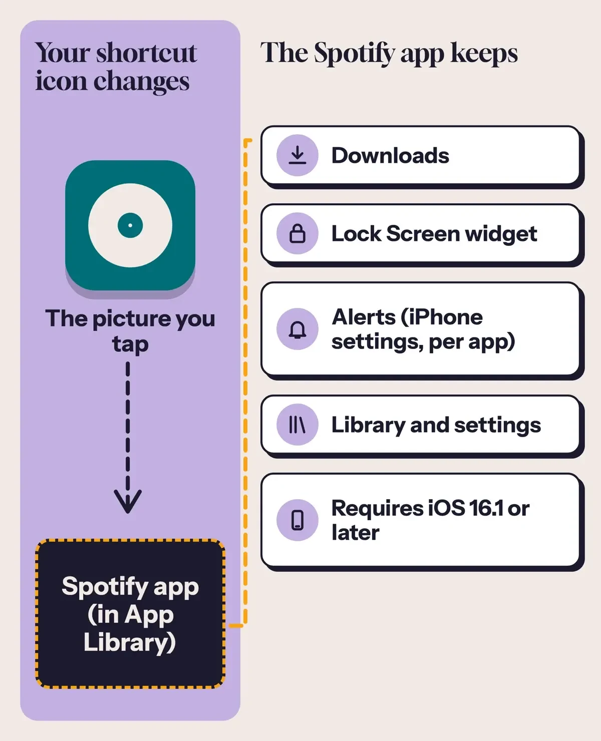 Diagram by DigitalTreed: what a Shortcuts icon changes for Spotify, based on Apple and Spotify Support pages, November 2026.
Keep the real Spotify app, and your downloads
Whichever icon opens the app, hiding the old green one takes one of two iPhone buttons that sound alike. Apple's page on removing or deleting apps says Remove from Home Screen sends the app to App Library, where it still works. Delete App isn't the same, since "Deleting an app removes it and its data from your iPhone."
For Spotify, that means offline music. Its reinstall page says "You need to re-download any downloaded music and podcasts after reinstalling the app."
Set up your shortcut icon first so Spotify stays one tap away, then hide the original:
- Touch and hold the green Spotify icon on your Home Screen.
- Tap Remove App.
- Tap Remove from Home Screen, not Delete App.
- Open Spotify from your new shortcut icon, or find the original in App Library.
Spotify widgets: the parts a new icon never touches
Apple's widgets page lets you "add them to your Home Screen or Lock Screen", but Spotify's iPhone help only covers a Lock Screen widget. Spotify's lock screen widget page lists two needs as of November 2026, "iPhone with iOS 16 or above" and "Spotify app version 8.8.26 or above", and these steps:
- Touch and hold the lock screen.
- Tap Customize, then select Lock Screen.
- Tap Add Widgets.
- Select the Spotify widget.
- Tap the close button, then Done.
Android gets a Home screen widget. Spotify's Android widget page says it needs "Spotify app version 8.9.60 or above". Install or update the app from its Google Play listing, where the developer shown is Spotify AB as of November 2026. Add the widget from a long press on the Home screen. Then tap Widgets, Spotify and Add. To resize it, long press the widget and pull one corner, which helps you line it up with matching icons.
What Spotify's brand rules let you reuse
Matching icons can't just be recolored copies of Spotify's logo. Its developer Design & Branding Guidelines are written for "any external developer integrating Spotify into their product", not for someone styling a phone. They still show how Spotify treats its logo: "The logo should not be misinterpreted, modified, or added to." They also rule out rotating it, filling its lines, stretching it, or using it "to make new objects or shapes".
The listener terms go further. Spotify's US End User Agreement says "These Terms do not grant you any rights to use any Spotify Brand Features whether for commercial or non-commercial use." Brand Features there include trademarks, logos and "any other features of the Spotify brand", and the Spotify Developer Terms, version 10, effective May 15, 2025, define Spotify Marks as broadly. It applies the same idea to pictures you upload. Its profile and playlist image guidelines bar images that violate copyright, trademark or personal image rights. They define a trademark as a word, slogan, symbol or design, such as a logo. So we'd skip recolored-logo packs and ask a lawyer before sharing or selling any icon that borrows the mark.
The developer guidelines also ask partner apps to avoid logos that look like "Spotify Green, the circle, and the waves". A record is round too. What matters is the mix. Leave out Spotify Green and the three waves, and a record, a speaker or a single note in your own palette still reads as music. If you design icons for a client, our branding strategy plan shows how a mark and its rules fit together.
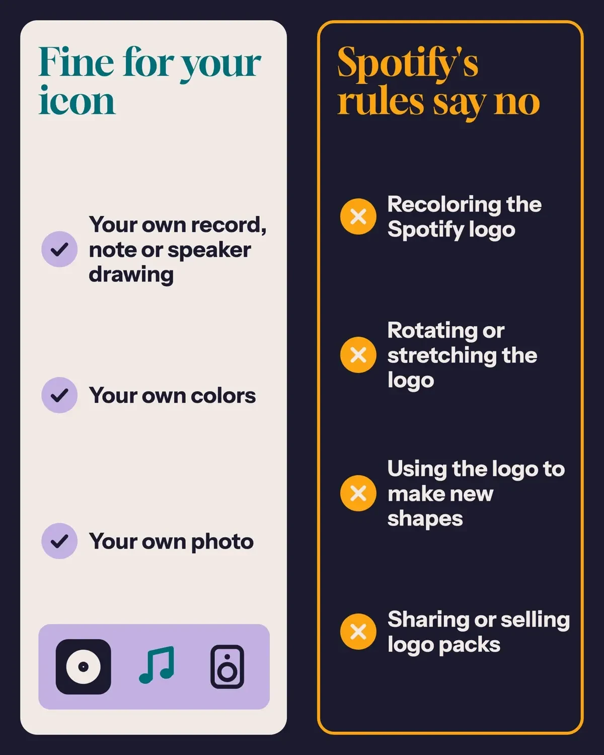 Diagram by DigitalTreed: Spotify's logo rules in plain words, from Spotify's developer Design & Branding Guidelines and its End User Agreement, November 2026. No logo shown.
Spotify icon aesthetic on Android
On Android, the Spotify icon aesthetic usually comes from the system theme, not a record or music note you draw yourself. Android's developer page on adaptive icons says that from Android 13, people can theme adaptive icons when the launcher supports it. The Android 13 features page names the switch: the "Themed icons toggle in system settings", and says icons then take on the coloring of your wallpaper and theme. Android tints only apps with a monochrome icon layer, and Spotify's support and developer pages we read don't say whether its icon has one. Google's adaptive icons page adds that "Starting with Android 16 QPR 2, Android automatically themes app icons for apps that don't provide their own."
Google's help pages we read don't describe giving one app its own picture on the stock Home screen, so we don't name third-party launchers here. Google does document the same downloads trap: its Home screen help says Remove takes an app off your Home screen only, while Uninstall takes it off your device. If a crowded phone feels slow, too, our guide to stopping background apps on Android covers that.
Music-themed palettes for your Spotify icon
A record, a note or a speaker on a plain tile is the easiest icon to draw yourself, and its two colors decide whether it'll read at Home Screen size. We drew 10 made-up designs and kept the 5 that passed every check. One check was the 3:1 contrast floor that WCAG 2.2 sets for graphical objects, and the W3C's guidance on non-text contrast counts stand-alone icons among them. Each line names our tile color, record color and measured contrast:
- Vinyl night: tile #1B1B2F, record #F2E9E4 (14.10:1 contrast)
- Lo-fi lilac: tile #C3B1E1, record #2E1A47 (7.89:1 contrast)
- Midnight chorus: tile #14213D, record #FCA311 (7.90:1 contrast)
- Paper notes: tile #F4F1DE, record #3D405B (8.87:1 contrast)
- Ocean playlist: tile #006D77, record #EDF6F9 (5.54:1 contrast)
Set the first hex code as your canvas fill, then draw the record in the second one.
Both failures paired a warm tile with a near-white record. Cassette coral scored 2.95:1 and Sunset synth 2.06:1. If you like those colors, darken the tile or use a dark record. Our tips for professional-looking graphics run a similar contrast test on text at 4.5:1, and our visual identity guide explains why a brand's personality comes before its palette.
Your playlist covers can match, too. Spotify's playlist cover page says Free and Premium users on mobile and tablet can tap Edit on a playlist, then Change playlist cover and Create cover art. There you'll add text and your own images, change background colors and add stickers. If you host a show, our guide to starting a podcast for your business covers the setup side.
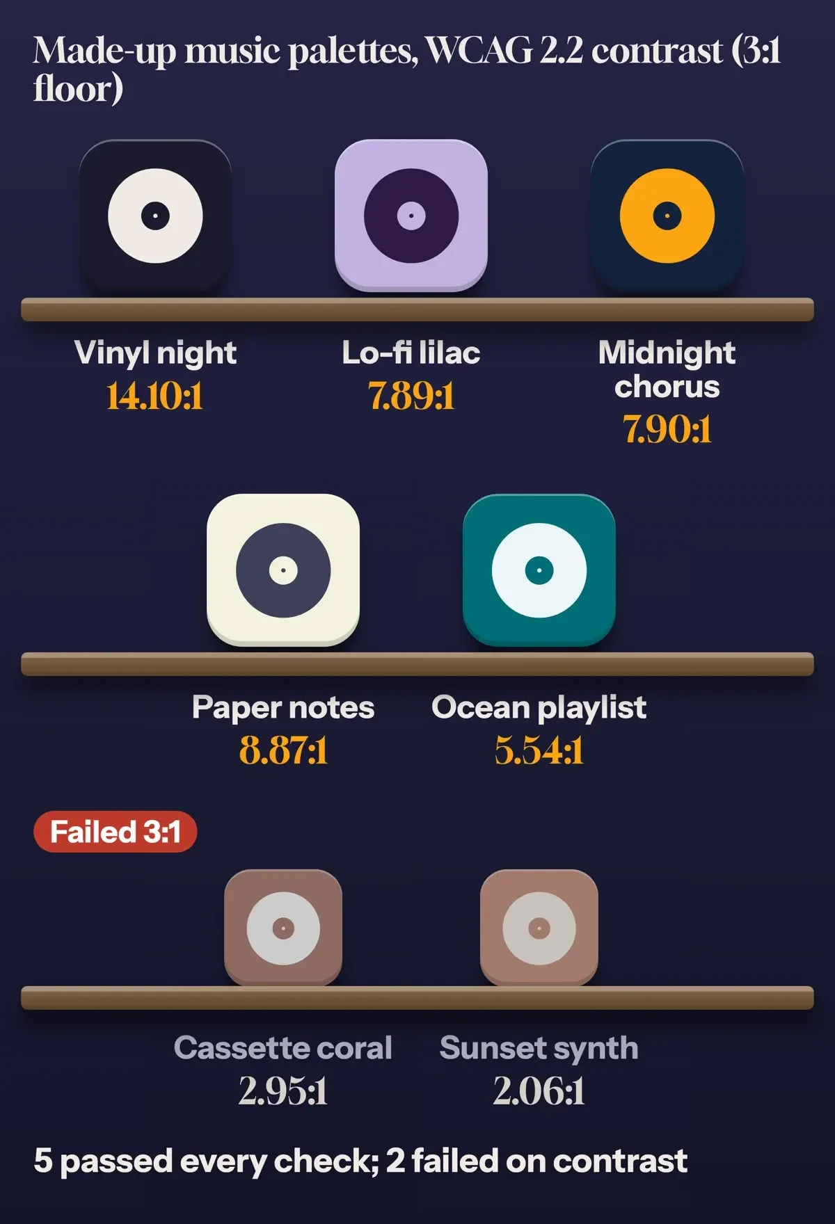 Diagram by DigitalTreed: five made-up music palettes that passed and two that failed, with contrast measured by test/icon_check.py, November 5, 2026.
Size your icon art for iPhone and Android
A shortcut accepts almost any photo. So a wrong size won't show an error; it'll show up later as soft edges or a clipped record. Apple's Human Interface Guidelines for app icons list a 1024x1024 px layout for iOS, iPadOS and macOS icons. Android's adaptive icons page sizes layers at 108x108 dp and says the logo must not exceed 66x66 dp, because only the inner 66x66 dp shows inside the masked viewport. The outer 18 dp on each side is kept for masking and visual effects. Google Play's icon design specifications ask for a 512 x 512 px full square with masked corners.
| Target | Size | Where the art should stay | Source |
|---|---|---|---|
| iPhone, iPad and Mac app icon | 1024 x 1024 px | Square canvas; the system rounds the corners | Apple HIG |
| Android adaptive icon layer | 108 x 108 dp | Logo 48 to 66 dp, centered | Android Developers |
| Google Play store icon | 512 x 512 px | Full square; Play masks the corners at a 30% radius | Google Play specs |
| Spotify's own icon (developer rule) | At least 21 px on screen | Clear space of half the icon height | Spotify developer guidelines |
For one drawing that works on both phones, draw at 1024 px square. Keep the record inside the middle 61.1% of the canvas, which is 66 divided by 108 and assumes your canvas fills the whole 108 dp layer. Our Facebook story size guide uses the same safe-zone idea for text near the edges.
Our test table lists all 10 made-up icons with the record's share of the shorter side, the contrast and the result:
| Design (made up) | Canvas (px) | Record (share of shorter side) | Contrast | Result |
|---|---|---|---|---|
| Vinyl night | 1024 x 1024 | 56.1% | 14.10:1 | Pass |
| Cassette coral | 1024 x 1024 | 56.1% | 2.95:1 | Fail: contrast |
| Lo-fi lilac | 1024 x 1024 | 58.0% | 7.89:1 | Pass |
| Bass line | 1024 x 1024 | 72.1% | 6.36:1 | Fail: safe zone |
| Jazz brass | 512 x 512 | 56.1% | 8.32:1 | Fail: 1024 px |
| Indie sage | 1024 x 768 | 56.1% | 6.56:1 | Fail: square, 1024 px |
| Sunset synth | 1024 x 1024 | 56.1% | 2.06:1 | Fail: contrast |
| Midnight chorus | 1024 x 1024 | 60.1% | 7.90:1 | Pass |
| Paper notes | 1024 x 1024 | 58.0% | 8.87:1 | Pass |
| Ocean playlist | 1024 x 1024 | 60.1% | 5.54:1 | Pass |
Bass line failed only the safe zone. Its record covered 72.1% of the canvas width, so a circular mask would trim its edge.
Jazz brass at 512 px and Indie sage at 1024 x 768 failed on size, and Indie sage failed again since it isn't square. Cassette coral and Sunset synth failed on contrast alone.
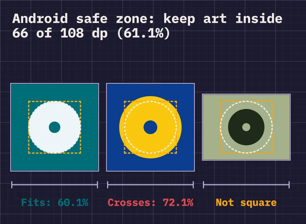 Diagram by DigitalTreed: the 61.1% safe zone (66 of 108 dp) drawn over three of our made-up test icons, from test/icon_check.py, November 5, 2026.
What we tested
We ran test/icon_check.py offline on November 5, 2026. It drew 10 made-up icons as PNG files, read each file back from disk and measured the record in pixels. Then it checked a square canvas, a 1024 px side, the 61.1% safe zone and 3:1 contrast.
Our pick: your own record icon, the real app in App Library
Draw a record or note at 1024 px square in one of the five passing palettes. Set it as a Shortcuts icon. Then send the real Spotify app to App Library with Remove from Home Screen, and add the lock screen widget as a second way in.
On Android, turn on themed icons and add Spotify's Home screen widget instead of hunting for a logo pack.
FAQ
Frequently asked
Will Siri still open Spotify after I change the icon?
Yes. Spotify's Siri and Spotify page lists iPhone on iOS 14 or above, and suggests adding "on Spotify" if Siri plays from another app.
Can I use the logo files from Spotify's media kit?
Spotify's logo and brand assets kit offers Full Logo and Primary Logo files in green, black and white. Under the rules above, we wouldn't recolor them.
Why is my Spotify lock screen widget grayed out?
Spotify's widget page suggests logging out and back in, and turning on 'Devices Lock Screen' in Spotify settings. It also lists turning on lock screen notifications in your device settings, updating Spotify and iOS, and a restart.
What dark color does Spotify use behind its player?
Spotify's developer design guidelines tell partner apps to pull a color from the artwork, or else "use Spotify color #191414". That near-black suits a dark tile.
How we made this guide: We read 24 Spotify, Apple, Google and W3C pages on November 5, 2026, and checked every quote against saved copies. We didn't install icon packs, sign in to Spotify or run these steps on a phone. Facts checked by the DigitalTreed team on November 5, 2026.
First published December 2023 with unsourced steps and a promotion plug. Rewritten November 5, 2026 around Spotify's own help and brand pages, with the plug removed.
Sources
- Spotify Support: Your Spotify notification settings
- Spotify Support: Reinstalling your Spotify app
- Spotify Support: Spotify lock screen widget on iPhone
- Spotify Support: Spotify Home screen widget on Android
- Spotify Support: Siri and Spotify
- Spotify Support: Customize your playlist cover
- Spotify Support: Profile and playlist user image guidelines
- Spotify for Developers: Design & Branding Guidelines
- Spotify Developer Terms (version 10)
- Spotify US End User Agreement
- Spotify Newsroom: Logo and Brand Assets
- App Store: Spotify: Music and Podcasts listing
- Google Play: Spotify: Music and Podcasts listing
- Apple Shortcuts User Guide: Add a shortcut to the Home Screen
- Apple iPhone User Guide: Remove or delete apps
- Apple iPhone User Guide: Change notification settings
- Apple iPhone User Guide: Add, edit, and remove widgets
- Apple Human Interface Guidelines: App icons
- Android Developers: Adaptive icons
- Android Developers: Android 13 features and APIs
- Android Developers: Google Play icon design specifications
- Android Help: Add apps, shortcuts and widgets to your Home screens
- W3C: Web Content Accessibility Guidelines (WCAG) 2.2
- W3C: Understanding Success Criterion 1.4.11 Non-text Contrast


Comments
No comments yet. Start the conversation below.